 News
News
Template: More Tag
This content is before the more tag.
Right after this sentence should be a “continue reading” button of some sort.
 News
News
This content is before the more tag.
Right after this sentence should be a “continue reading” button of some sort.
 News
News
Welcome to colorlib.com. This is your first post. Edit or delete it, then start blogging!
 Markup
Welcome to image alignment! The best way to demonstrate the ebb and flow of the various image positioning options is to nestle them snuggly among an ocean of words. Grab a paddle and let’s get started.
On the topic of alignment, it should be noted that users can choose from the options of None, Left, Right, and Center. In addition, they also get the options of Thumbnail, Medium, Large & Fullsize.

The image above happens to be centered.
 The rest of this paragraph is filler for the sake of seeing the text wrap around the 150×150 image, which is left aligned.
As you can see the should be some space above, below, and to the right of the image. The text should not be creeping on the image. Creeping is just not right. Images need breathing room too. Let them speak like you words. Let them do their jobs without any hassle from the text. In about one more sentence here, we’ll see that the text moves from the right of the image down below the image in seamless transition. Again, letting the do it’s thang. Mission accomplished!
And now for a massively large image. It also has no alignment.
The image above, though 1200px wide, should not overflow the content area. It should remain contained with no visible disruption to the flow of content.
And now we’re going to shift things to the right align. Again, there should be plenty of room above, below, and to the left of the image. Just look at him there… Hey guy! Way to rock that right side. I don’t care what the left aligned image says, you look great. Don’t let anyone else tell you differently.
In just a bit here, you should see the text start to wrap below the right aligned image and settle in nicely. There should still be plenty of room and everything should be sitting pretty. Yeah… Just like that. It never felt so good to be right.
And just when you thought we were done, we’re going to do them all over again with captions!

The image above happens to be centered. The caption also has a link in it, just to see if it does anything funky.

The rest of this paragraph is filler for the sake of seeing the text wrap around the 150×150 image, which is left aligned.
As you can see the should be some space above, below, and to the right of the image. The text should not be creeping on the image. Creeping is just not right. Images need breathing room too. Let them speak like you words. Let them do their jobs without any hassle from the text. In about one more sentence here, we’ll see that the text moves from the right of the image down below the image in seamless transition. Again, letting the do it’s thang. Mission accomplished!
And now for a massively large image. It also has no alignment.

The image above, though 1200px wide, should not overflow the content area. It should remain contained with no visible disruption to the flow of content.

And now we’re going to shift things to the right align. Again, there should be plenty of room above, below, and to the left of the image. Just look at him there… Hey guy! Way to rock that right side. I don’t care what the left aligned image says, you look great. Don’t let anyone else tell you differently.
In just a bit here, you should see the text start to wrap below the right aligned image and settle in nicely. There should still be plenty of room and everything should be sitting pretty. Yeah… Just like that. It never felt so good to be right.
And that’s a wrap, yo! You survived the tumultuous waters of alignment. Image alignment achievement unlocked!
 Markup
This is a paragraph. It should not have any alignment of any kind. It should just flow like you would normally expect. Nothing fancy. Just straight up text, free flowing, with love. Completely neutral and not picking a side or sitting on the fence. It just is. It just freaking is. It likes where it is. It does not feel compelled to pick a side. Leave him be. It will just be better that way. Trust me.
This is a paragraph. It is left aligned. Because of this, it is a bit more liberal in it’s views. It’s favorite color is green. Left align tends to be more eco-friendly, but it provides no concrete evidence that it really is. Even though it likes share the wealth evenly, it leaves the equal distribution up to justified alignment.
This is a paragraph. It is center aligned. Center is, but nature, a fence sitter. A flip flopper. It has a difficult time making up its mind. It wants to pick a side. Really, it does. It has the best intentions, but it tends to complicate matters more than help. The best you can do is try to win it over and hope for the best. I hear center align does take bribes.
This is a paragraph. It is right aligned. It is a bit more conservative in it’s views. It’s prefers to not be told what to do or how to do it. Right align totally owns a slew of guns and loves to head to the range for some practice. Which is cool and all. I mean, it’s a pretty good shot from at least four or five football fields away. Dead on. So boss.
This is a paragraph. It is justify aligned. It gets really mad when people associate it with Justin Timberlake. Typically, justified is pretty straight laced. It likes everything to be in it’s place and not all cattywampus like the rest of the aligns. I am not saying that makes it better than the rest of the aligns, but it does tend to put off more of an elitist attitude.
 Markup
Putting special characters in the title should have no adverse effect on the layout or functionality.
Special characters in the post title have been known to cause issues with JavaScript when it is minified, especially in the admin when editing the post itself (ie. issues with metaboxes, media upload, etc.).
This is a test to see if the fonts used in this theme support basic Latin characters.
| ! | “ | # | $ | % | & | ‘ | ( | ) | * |
| + | , | – | . | / | 0 | 1 | 2 | 3 | 4 |
| 5 | 6 | 7 | 8 | 9 | : | ; | > | = | < |
| ? | @ | A | B | C | D | E | F | G | H |
| I | J | K | L | M | N | O | P | Q | R |
| S | T | U | V | W | X | Y | Z | [ | |
| ] | ^ | _ | ` | a | b | c | d | e | f |
| g | h | i | j | k | l | m | n | o | p |
| q | r | s | t | u | v | w | x | y | z |
| { | | | } | ~ |
 Markup
Verify that:
 Edge Case
Nested and mixed lists are an interesting beast. It’s a corner case to make sure that
 News
News
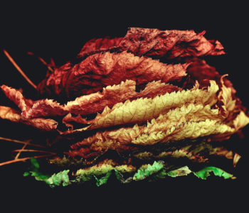
This post should display a featured image, if the theme supports it.
Non-square images can provide some unique styling issues.
This post tests a vertical featured image.
 News
News
This post should display a featured image, if the theme supports it.
Non-square images can provide some unique styling issues.
This post tests a horizontal featured image.
 News
News
This is the post content. It should be displayed in place of the user-defined excerpt in single-page views.